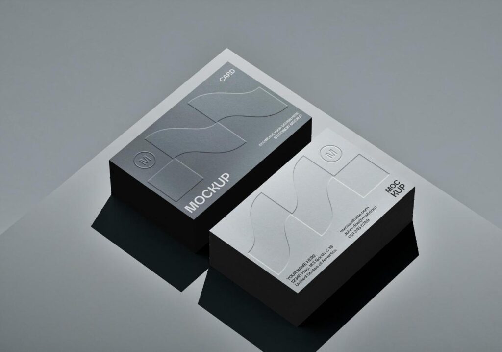
Why Your Packaging Should Look Like Your Online Brand
For most brands today, especially in Malaysia, the customer journey starts online. People discover you on Instagram, see your products on Shopee or Lazada, click into your website, and then decide whether to buy.
When the parcel arrives and they finally see the actual box, they’re quietly comparing it to what they saw on screen.
If the packaging box looks totally different from your website and social media branding, the experience feels disconnected. The product is real, but the brand feels less reliable.
When everything aligns — your box, your website, your Instagram feed — customers feel like they’re dealing with one clear, consistent brand. That makes you easier to recognise, easier to trust, and easier to remember.
Getting the Basics Right: Colours, Fonts and Brand Mood
Brand alignment starts with simple visual decisions that show up everywhere: colours, fonts and the overall “mood” of your brand.
Think about what people see most often:
Your brand colours on your website, social posts and ads
Your typography (the style of your headlines and body text)
Your brand mood — calm, playful, premium, fun, etc.
If your website and Instagram use warm neutrals and soft tones, but your packaging is bright neon, the brand feels split in two. If your online identity is minimal and premium, but your box design is crowded and loud, the product feels cheaper than your marketing.
A simple guideline:
If someone screenshots your homepage and places it next to your packaging box, they should clearly feel like they belong to the same brand.
You don’t need a perfect 1:1 match, but you do want the same “vibe”: similar colour family, similar font style, same kind of personality.
Turning Your Product Page into Packaging Storytelling
Your product page is already a structured story: name, what it is, who it’s for, key benefits, then more detail below. You can use that structure to shape your packaging.
Imagine a typical product page:
Product name at the top
A short line explaining what it does
A few key benefits or features
Supporting details further down
On the box, you can mirror that in a simpler way:
Front panel: product name + short benefit line that feels like the headline on your website
Side or back panels: a slightly longer description, main benefits and usage instructions in the same tone as your product copy
That way, when someone goes from seeing the listing online to holding the box, the story doesn’t change. The words may be shorter, but the promise and the style stay consistent. It feels like the same product they clicked “Buy” on.
Letting Social Media Personality Show Up on the Box
For many Malaysian brands, social media is where the real personality lives.
Maybe your feed is soft and minimal with pastel tones and gentle captions. Maybe it’s bold, colourful and full of memes and high-energy reels. Either way, that’s what your followers are getting used to.
Packaging can borrow that personality:
A calm, neutral feed usually pairs well with packaging that’s clean, soft and minimal, with small, thoughtful details.
A bright, energetic feed can support packaging with stronger colours, bolder typography and playful visual elements.
You also want to think about how the box will appear in your content. If you plan to film unboxing videos or flatlays, a design that photographs well and doesn’t create harsh glare (matte or soft-touch finishes help) will make your content feel more polished.
Using the Box as a Bridge Back to Your Digital Channels
Good alignment isn’t just visual; it’s also about how packaging connects people to your digital touchpoints.
The box can quietly guide customers back to your online world, for example by:
A QR code that leads to a “how to use” page or video
A short URL to your main online store or product page
A line inviting customers to follow your Instagram or TikTok for tips and updates
The key is to design these elements with your branding, not as random stickers. Use the same colours, same tone of voice and same type of icon or style people already see online.
Even small touches like a thank-you message inside the lid written in the same voice as your captions make the experience feel like one continuous relationship, not a series of disconnected moments.
Keeping Consistency as Your Brand Grows
As your brand grows, you’ll probably work with different people: web designers, social media managers, freelance creators and printing companies. Without clear guidance, each person might make small changes that slowly pull your brand apart.
That’s where a simple brand style guide becomes very practical.
It doesn’t need to be complicated. A few pages that cover:
Your main and secondary brand colours (with HEX / RGB / CMYK codes)
Preferred fonts for web and print
How your logo should and shouldn’t be used
A few example layouts for social media and packaging
The kind of tone you use in copy (formal, friendly, playful, etc.)
…is already enough to keep everyone moving in the same direction.
Share this guide with your packaging printer too. When they know your colour codes and style, they can catch things that don’t look right and help you stay on-brand across different packaging runs.
Why This Alignment Matters in Real Life
When your website, socials and packaging box design line up, you’re not just “being consistent for fun”. You’re making it easier for customers to:
Recognise you instantly
Feel confident that they ordered from the right brand
Build trust over time
Remember you when they’re ready to buy again
In busy categories like skincare, F&B, lifestyle, home goods and many e-commerce products, the brands that look coherent across every touchpoint feel more stable and professional. That’s often the deciding factor between “I’ll try this once” and “I’ll come back to this brand again”.
Conclusion: One Brand, Many Places — Same Experience
Your brand doesn’t live in one place anymore. It shows up in Instagram posts, Lazada thumbnails, website banners, email signatures, courier parcels and the physical box in someone’s hand.
Aligning your packaging box design with your website and social media branding isn’t about making everything identical. It’s about making sure every interaction feels like it’s coming from the same brand personality.
When colours, fonts, language and small design details all support the same identity, customers feel they know you better — and that’s exactly what makes them feel comfortable buying from you again.
Get a Free Quote & Same-Day Estimate
Unsure if UV will stick? Send a small sample—we’ll test adhesion, finish, and colour before you commit.
FAQs
Because customers move between online and offline all the time. When everything looks connected, your brand feels more professional and trustworthy.
Not exactly, but it should clearly feel related — similar colours, font style, tone of voice and main product message.
Create a simple brand style guide with your colours, fonts, logo rules and example layouts, then share it with anyone who designs or prints for your brand.
